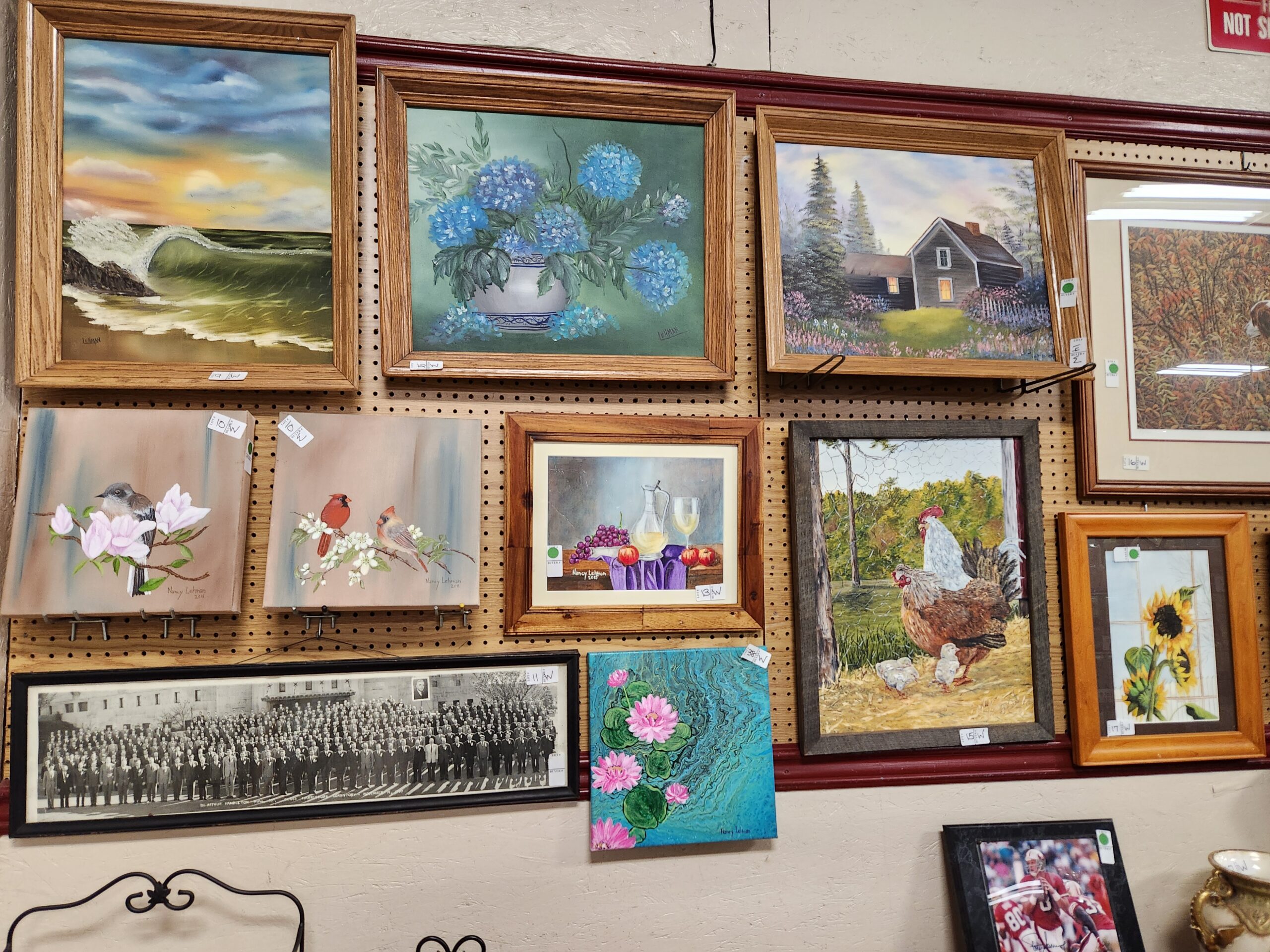
Yarn covered mounts and distressed furniture are hot trends in interior decorating right now; but they don’t, necessarily, work in everyone’s home. Instead, a gallery wall is a timeless classic that can work in any space. Inspired by magazines spreads and Pinterest, I decided to give it a whirl. I realize that spatial reasoning is something I am lacking. That giant bruise on my arm? Yep, lacked the spatial reasoning and ran right into the door frame. Hang a gallery wall? You might as well ask me to explain mustard to a frog.

For those of us just starting out, auction is a great place to find special pieces to make your place your home. Over the last several months, I have been accumulating a large collection of prints and paintings from auctions here and there. I dutifully brought them home and leaned them against the wall; where they have been sitting, mocking me ever since. Each time I placed them I heard their tentative plea “Do something with us!” Over the holidays , I decided it was time to tackle my dream gallery wall.
Since this was such an intimidating project, I decided to get some instructions for a higher spatial power… Heather. Here are her steps to gallery wall success:
Step #1: Pick out your favorite picture/painting (no more than your top 3 favs)
Step #2: Determine where you want the favorites on your wall (front and center? Off to the side? At the end?) Keep this in mind for placement of all the others.
Step #3: Count the number of pictures you are going to hang and look at the size. Are they all in 4×6 frames? Are they large and small? Approximately how much wall space will they take up? I have found a small grouping can grow to include the whole wall and still look nice without any “grid” planning!
Step #4: Based on size, start in the upper left area. Pick any picture as your jumping off point. Hang it.
Step #5: Look at your other pictures – do any have similar colors, or similar frames? Do not choose one with the exact same size unless they are all a uniform size and shape. Hang the next picture either to the right or below. Keep it in mind if it is smaller or much larger hang to right. IF it is about the same size hang directly below.
Step #6: Repeat step #5. Continuing to the right from top to bottom. Trying to keep in the same spatial area with similarities to keep your eye moving across.
First, I took a few deep breaths and muster up the courage to begin. Here is the my “gallery space”

Second, I laid out all my pictures. I found a few more hiding out of frames. Note my expert helpers were choosing their favorites too.


Then I got to work hanging. My husband was NOT home at the time. So I had a very hard time judging if thing were evenly spaced and straight. Unfortunately, the cats wouldn’t hold the photos up for me to stand back and take a look. Nor would they direct me to move the landscape a three inches to the left.

After getting everything hung, Heather informed me that spacing is slightly uneven and that causes it to look disjoined. Thanks for that.
Disclaimer: Make sure you have another person available to help you with your spacing once you start hanging. The spaces SHOULD be even although mine are not.
That being said, the whole thing came out looking pretty great. It got all those pictures up off the floor that have been sitting there for longer than I care to admit (July 2013); and now that I am no longer scared of process, I think I’ll try again with the pictures from my wedding, currently collecting dust on the bookshelf!


